Reviewing & redesigning streaming app, Binge
The year is 2023, and streaming platforms all share a common problem.
There is no USP that differentiates Netflix from Disney+, or Stan from Binge. Where Netflix had previously carved the way and enjoyed a technical moat for the better part of a decade, it was only a matter of time before more conventional media holders caught up.
To be a competitive streaming product today — it all comes down to content. Netflix was one of the first to anticipate the rise of competition and invested early into generating their own in-house content. And as traditional media holders spun up their platforms, they started clawing back their content to entice users into their own products.
Users that once felt liberated and self identified as ‘cable cutters’ are now enduring the same fragmented content experience they once sought refuge from.
Before diving further, I felt it was important to acknowledge that growth and maintaining a user base within this sector is largely dependant on complex streaming rights and continued investment into exclusive content. However, it does add important context to some design decisions.
For this exercise however, I wanted to zoom in onto one service in particular, Binge. Binge is an Australian streaming service that is owned by Foxtel, a cable TV service provider. I chose Binge because its the only platform that I’ve actually unsubscribed due to frustration from the product design itself, I always felt like I was battling the product, and despite using ubiquitous patterns, always felt like it left me in a constant puzzle.
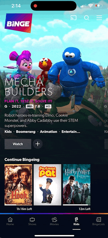
Visiting the home screen is a familiar experience to other platforms. Hero content champions the page, with carousels of content sorted below. Let’s zoom in on the unique decisions Binge has made with their product design.
Repeating carousels
A long standing pattern in streaming, Binge goes against the grain here by choosing to not have an ‘end’ to their carousels. Each carousel infinitely repeats itself, to give users a bit of context on their progress, an indicator appears above the carousel indicating this behaviour.
As a user, this made me feel like Binge lacked content and was obfuscating it by repeating this pattern in all of its carousels, as well as generally being frustrating to navigate because I had to now watch the indicator as well, to understand if I had scrolled into the beginning again.

Identical cards for different experiences
Binge chooses to use a single card style for its content, typically, good behaviour as using a repeated pattern and style builds familiarity — ensuring the user knows what to expect before tapping their screen. However, these identical designs hide different experiences behind their innocuous cards:
- Default: What you’d expect, tapping on the card will take you to your content, ready to watch or review detailed information.
- Collections: Binge’s take on content families which act like folders, containing more cards and carousels to navigate. For example, the Fast & The Furious collection contains a carousel of all the series movies. Likewise, the Christmas collection houses a single carousel of curated Christmas themed content.
- Live channels: These are streams of traditional channels, such as FOX, Discovery, CNN, etc. Tapping onto one of these skips the content page and immediately opens a live stream of the content. These Live channels typically display the channel logo and a live indicator, but not always.
- Coming Soon: For content that is not yet available, these pages look identical to the Default content pages, however tapping Watch will only stream the trailer.

As a user, you feel like you are always landing on a page you weren’t expecting to. While all of these different experiences are valuable and make Binge a unique experience, typically the Live channels, they should be celebrated and visually distinct to set expectations, not build frustrations.
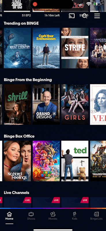
Navigation bar
Binge’s navigation bar appears conventional on first glance, however, as soon as you try looking for your account management tools, or, scroll from too far on the viewport — you’ll notice it hides a complex drawer pattern.
Burying account management tools is not unusual, however, I’ve never quite seen a pattern like this one — and for good reason, its not intuitive and odd. I can only conclude that the navigation bar was already filled, thus hiding a drawer was the next reasonable choice for future development?
So let’s zoom in on what’s populating the premium space, “Home, Shows, Movies, Kids, BingeList”. Whats a BingeList?
BingeLists is basically a ‘Watchlist’, where you can continue watching, rewatch, personalized recommendations and of course, your saved list.
Hmm, does this need its own space? I’ve never really used this page and most of its content. It definitely feels like a unique decision to add more complex patterns to compensate for the lack of real estate, and results in one of the most complex navigation bars I’ve seen.
Animation locking on content view
Typically, when you choose to watch content on a streaming platform, you tap the play button, and your content fills the screen — ready to go. Nice, slick and exactly what you wanted.
Binge has a unique ‘watch’ layout, let’s look at what that looks like.
What was all that stuff that just flashed on my screen?
Binge groups these tabs by what appears to be Relevant Content and, Settings. But why do we need all the extra fluff? Navigating the content is comprimised in a new, curated & restricted view, while the settings are using virtually none of the reserved real estate. The only benefit this pattern allows is to both view content and continue to, with limitations, browse.

Other services have used less intrusive options, such as YouTube with a collapsed banner, or Disney+ using a popover video (courtesy of iOS). It’s a puzzling choice, and flicking the screen away just to show that it does exist before it scurries away just screams ‘pre-release’ or ‘bug’.
Out of pure frustration, over 2 days I reimagined what my flavour of Binge could look like, addressing my particular pain points. Here’s where things ended up:
Improving scannability & expectations
I wanted to give cards that had differing UX on interaction, a more distinct appearance, allowing the user to build familiarity with the interaction and the visual appearance over time.
Some cards were a bit more abstract and needed some visual enhancements to allude to the experience within:
- ‘Live TV’ where content immediately plays, I felt a Play icon was most appropriate. I also added channel icons and repeated the new Live TV icon to build familiarity.
- ‘Collections’ are essentially folders, after a few visual mockups I settled on a stacked appearance which felt best communicated the metaphor.

Uniqueness
The first consideration, is the crowded streaming space itself, what sets Binge apart from its rivals — why would a loyal Netflix customer start paying for Binge? Let’s dive into the USPs:

Binge’s opportunities lie in promoting their Live TV and Collections content. Collections is a critical opportunity given the current fragmentation across all other streaming platforms. For example, to watch Pokémon in it’s entirety today, you need to switch between 8 different services. Fragmented collections and the transient nature of content from platforms is one of the most complained about behaviours of present-day streaming.
It’s sister company, Kayo — also serves as a growth opportunity to challenge the Sports offering of local rival, Stan. As of today however, both Kayo and Binge require separate (and pricey) subscriptions, whereas Stan offers a cheaper ‘add-on’.


Takeaways
Overall, I enjoyed this exercise — streaming apps is a new space for me and I was able to walk away with some key takeaways.
- Use patterns that users understand if they are available to you. Binge’s complex navigation bar/shelf hybrid is a great example of taking something widely understood and making it overly complex, creating user frustration and a ‘negative’ surprise.
- Celebrate your unique offering, shout it from mountain tops. Lean into what makes your product unique, especially if you are in a crowded space where product differentiation may be difficult.
- Create new visual metaphors when you need to. A user should know what's going to happen, before they interact with the product. By repurposing existing patterns haphazardly, you can frustrate your users as they fight against your product.


